• Personal Projects
    • IQVIA Technologies
  • Contact
Menu

AUSTIN HOYT DESIGN

  • Personal Projects
  • Current Client Work
    • IQVIA Technologies
  • Contact

FORUM JP Walker Welcome Back

Stoked to see JP back on FORUM. A true legend is back on a legendary board brand. To celebrate JP’s return, I built out these designs keeping in mind the new FORUM look and feel graphic elements. This was one of those ideas I had and needed to design and share out.

I’ve been a huge fan of JP and his ledgendary riding for all of his career. Two of my favorite movies parts of all time was True Life and Chulksmack. Two film that were both heavily influential in my riding and progression.

Congrats again JP!

FORUM_Ad_Comp1_JP_JP White Square 2.png
FORUM_Ad_Comp1_JP_JP White Square 4.png
FORUM_Ad_Comp1_JP_JP White Square 1.png
FORUM_Ad_Comp1_JP_JP White Square 3.png
Congrats_JP-FORUM Poster Concept.jpg
FORUM_Ad_Comp1_JP_Artboard 2.png
FORUM_Ad_Comp1_JP-01.png

FORUM Snowboard Concept

We all know as riders; FORUM is such an important staple in snowboarding’s history along with the pros that carried it back in the day.

This idea was what could bringing something back look like? My concept shows some sort of spirt levitating up from the ground and taking along with it the FORUM logotype (pretty sure there is a new one on the way along with the iconic “F”) I wanted to include mountains in the foreground and background but not just any style of mountain; I wanted it to feel digital, almost like 80’s style retro with opt-art and digital grids. I wanted pools in the foreground that the logotype was being pulled up from dripping something pink goo like. The top and bottom feeling like space with stars and digital glitch effects sprinkled in. 


FORUM_Export_1.jpg
FORUM_Export_2.jpg
FORUM_Export_4.jpg
FORUM_Export_3.jpg

Jeremy Jones Clip High Board Concept

A highly influential snowboard legend, Jeremy Jones has had such an impact on snowboarding and has inspired many (including myself) to push the boundaries of skill and re-define what snowboarding can look like creatively. Widely known for his many video parts in the streets Jones’ influence continues to cross over into the backcountry throughout the decades.
-—
As a longtime fan, I asked myself as a designer and creator, what would I design and create for a pro? Having no direction, I had a long think about where Jeremy had been throughout his career. The design is a visual collage of images dating back to old Mack Dawg video clips shot on film (pretty sure), to the days on Burton and some of the old catalog shoots up on through to Nitro and some on-location shots hitting the down rail.


I was also inspired by urban street environments where you often see poster paste-ups stacked one on top of one another and they’re often torn ripped up and weathered. I’ve always liked that textured, almost graffiti like look those kinds of paste-ups.

Desaturating the photos, working in textured edges and making it feel like a paste-up wall was my primary goal. Streets and urban environments shaped so much Jeremy’s career and I thought it fit well with the visual composition. 


The Clip High concept was something I pulled from the BombHole podcast. It’s mention was in reference to “getting a piece” to feed your passion whether it’s filming a social video clip skating or snowboarding or something else that feeds your passion on the daily no matter what. That idea really stuck with me.

Jeremy_Jones_Insta_Export_1.jpg
Jeremy_Jones_Insta_Export_2.jpg
Jeremy_Jones_Insta_Export_4.jpg
Jeremy_Jones_Insta_Export_3.jpg

Marhar Snowboard Design Contest

Preface: Marhar Snowboards held a snowboard design contest named “Marhar at Home”. Voted on by people following their Instagram account; got to have their board produced.

Marhar at Home Snowboard Design Contest Submission

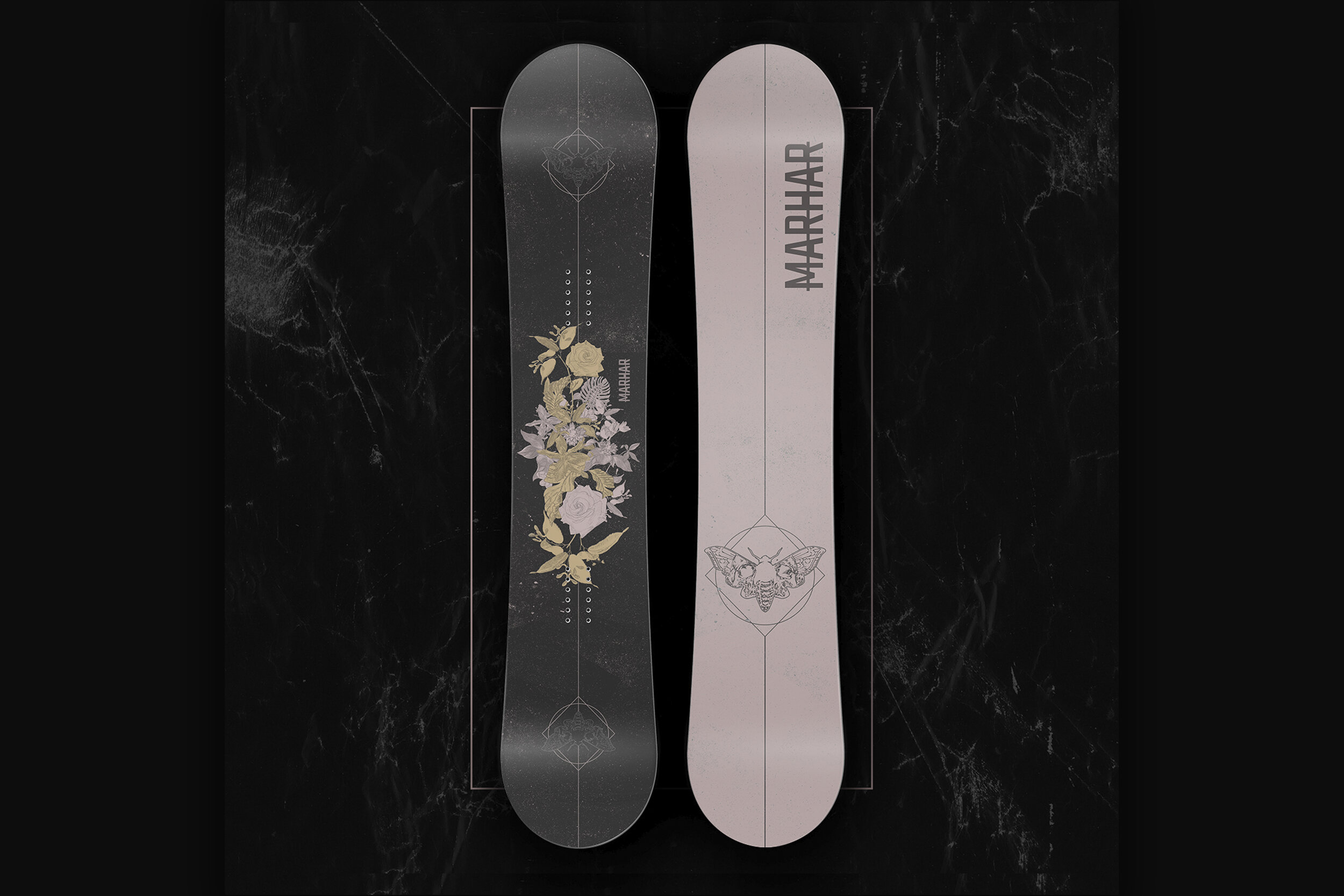
This is a collage of plant and floral drawings along with grunge style textures that contribute to the overall mood and color tones of this design. I had a ton of fun working out this idea for a couple of weeks during some downtime.

Marhar_Marhar Board Design Feature1.jpg
Marhar_Marhar Board Design Feature2.jpg
Marhar_Marhar Board Design Feature4.jpg
Marhar_Marhar Board Design Feature3.jpg
Marhar_Marhar Board Design Feature5.jpg

DC Snowboard Design Contest

Preface: Back in January 2021 DC Snowboards hosted a snowboard design contest named ”Design It Yourself” The winner voted on by the people following the Instagram account, got to have the board produced.

Muse - Contest Results: Top 16

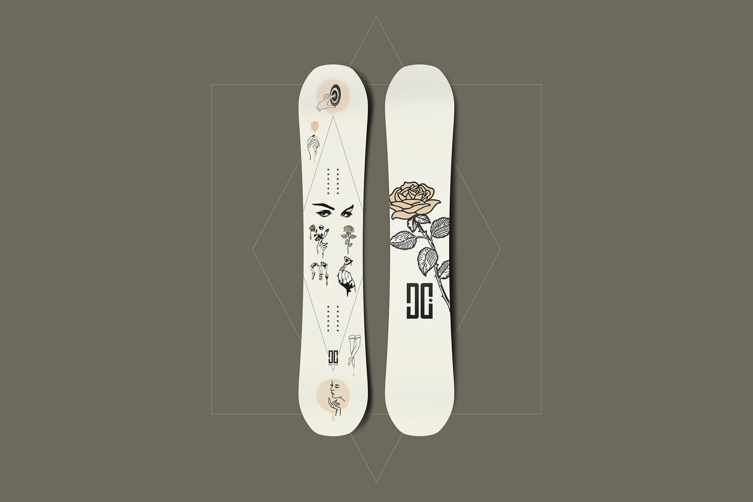
My snowboard design entry for the DC Snowboards design contest. I had a blast building this design. Loosely based off of tattoo style design that incorporates heavy ink outline shapes along with inspiration from my Wife as my artistic muse.

DC_DC Snowboard Design Feature 1.jpg
DC_DC Snowboard Design Feature 2.jpg
DC_DC Snowboard Design Feature 5.jpg
DC_DC Snowboard Design Feature 4.jpg
DC_DC Snowboard Design Feature 6.jpg
DC_DC Snowboard Design Feature 3.jpg
DC_DC Snowboard Design Feature 7.jpg

Salomon Snowboard Design Contest Entry 2

Preface: Back in April 2020 Salomon Snowboards hosted a snowboard design contest named “Stay Inside the Lines.” The winner voted on by the people following the account, got to have the board produced as a part of the Salomon Snowboard production lineup for the 2021 season.

Entry 2

Inspired by ripped up textures and an urban style paper pasteup handdrawn illustration.

Salomon_Salomon_Board1-Intro.jpg
Salomon_Salomon_Board1-Feature 1.jpg
Salomon_Salomon_Board1-Feature 2.jpg
Salomon_Salomon_Board1-Feature 3.jpg

Salomon Snowboard Design Contest Entry 1

Preface: Back in April 2020 Salomon Snowboards hosted a snowboard design contest named “Stay Inside the Lines.” The winner voted on by the people following the account, got to have the board produced as a part of the Salomon Snowboard production lineup for the 2021 season.

Entry 1

Inspired by abstract art full of color and textures while incorporating a few clean line design shapes around the Salomon logo at the center.

Salomon_Salomon_Board2-Intro.jpg
Salomon_Salomon_Board2-Feature 1.jpg
Salomon_Salomon_Board2-Feature 2.jpg
Salomon_Salomon_Board2-Feature 3.jpg

The Boarding House Logo Design

Beyond stoked to have designed the new Boarding House logo for E-Stone and the “Stonie’s Buds” podcast.

This design work really hits home with me as I grew up in Vermont which was home to the original Boarding House board shop in Burlington, VT that was run by Pro Snowboarder Andy Coghlan. This shop was such an important staple in snowboardings history and helped launch a large snowboarding culture and community.

Boarding_House_Social_Post_0000_1.jpg
Boarding_House_Social_Post_0001_2.jpg
Boarding_House_Social_Post_0002_3.jpg
Boarding_House_Social_Post_0003_4.jpg
Boarding_House_Social_Post_0004_5.jpg
Boarding_House_Social_Post_0005_6.jpg
Boarding_House_Social_Post_0006_7.jpg

Foo Fighters Forever Fans Tee

Broken-hearted over the passing of Foo Fighters drummer Taylor Hawkins. As a 26-year superfan of the band and it’s members, this idea came to me thinking about the band and the Foos music these last couple of days since the devastating announcement. A talent rock music will forever miss. Foos Fan Forever.

Foo Fighters Fans_1.jpg
Foo Fighters Fans_2.jpg
Foo Fighters Fans_3.jpg
Foo Fighters Fans_4.jpg

Foo Fighters 'Ol Saint Nick Medicine at Midnight Beer

Just recently finished a homebrew project with my brother-in-law Mike. We started this around Christmas time and named it Ol’ Saint Nicks Medicine at Midnight. It’s a lager-style beer chuck full of aromatic holiday spices and dried orange peel.

The name came from Mikes's idea of Santa being the symbol of the season and me, deciding to add Medicine at Midnight at the end.

It was a random idea I had that came from the new Foo Fighters song and album titled “Medicine at Midnight.” I designed the label with street art/graffiti/grunge styles along with big pops of bright colors. I also included a few lyrics of the song written out in the design.

If you look at the bottom left corner of the label, there’s a QR code that goes straight to the Foos's song Medicine at Midnight. It’s beer with a soundtrack!

Bottle_Design3.jpg
Box_Design.jpg
Box_Design2.jpg
Bottle_Design1.jpg
Bottle_Design2.jpg
Ol_St_Nick_Label_Insta.jpg
272363510_996581794076225_1912824010573994818_n.jpg

THE BOMB HOLE TEE CONTEST 2022 ENTRY 1

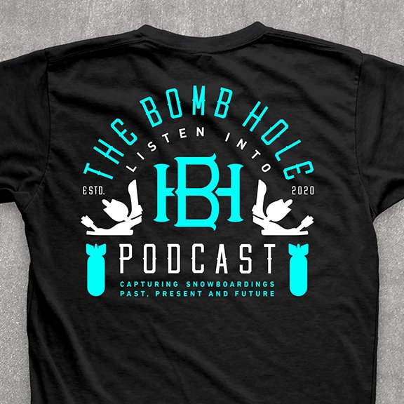
I love a good type of lockup and monogram. Flanked with two binding icons and bomb shapes, this was one of my first ideations. I couldn’t decide on which colorway; either way, I wanted it to be bold and eye-catching.

BH_2022_Comp1-Rev-BackA-Rev-Cropped.jpg
BH_2022_Comp1-Rev-BackA-Rev.jpg
BH_2022_Comp1-Rev-FrontA.jpg
BH_2022_Comp1-Rev-BackB-Rev-Cropped.jpg
BH_2022_Comp1-Rev-BackB-Rev.jpg
BH_2022_Comp1-Rev-FrontB.jpg

THE BOMB HOLE TEE CONTEST 2022 ENTRY 2

3rd Place Contest Win for 2022 per votes from the Bomb Hole fan community!
__
It started with the font…

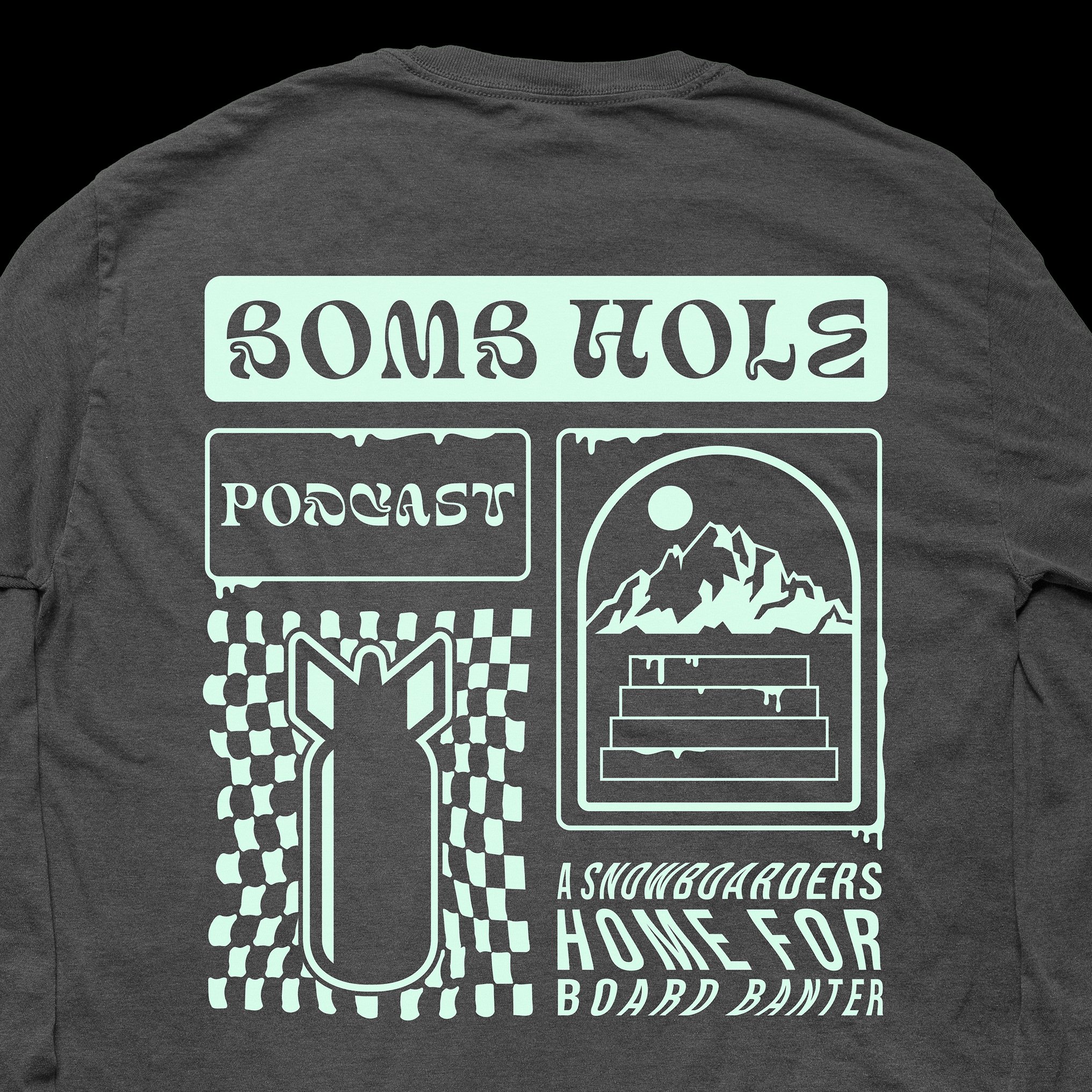
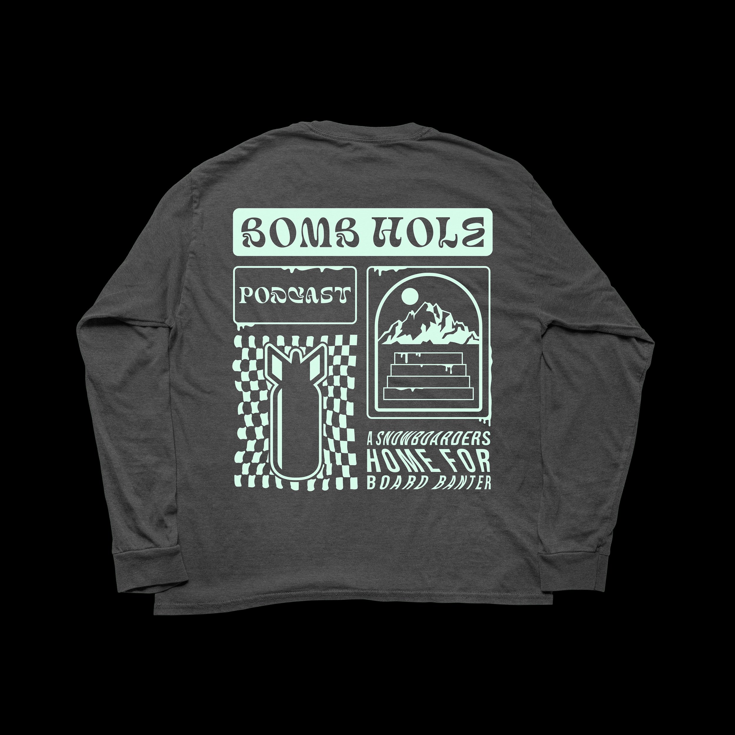
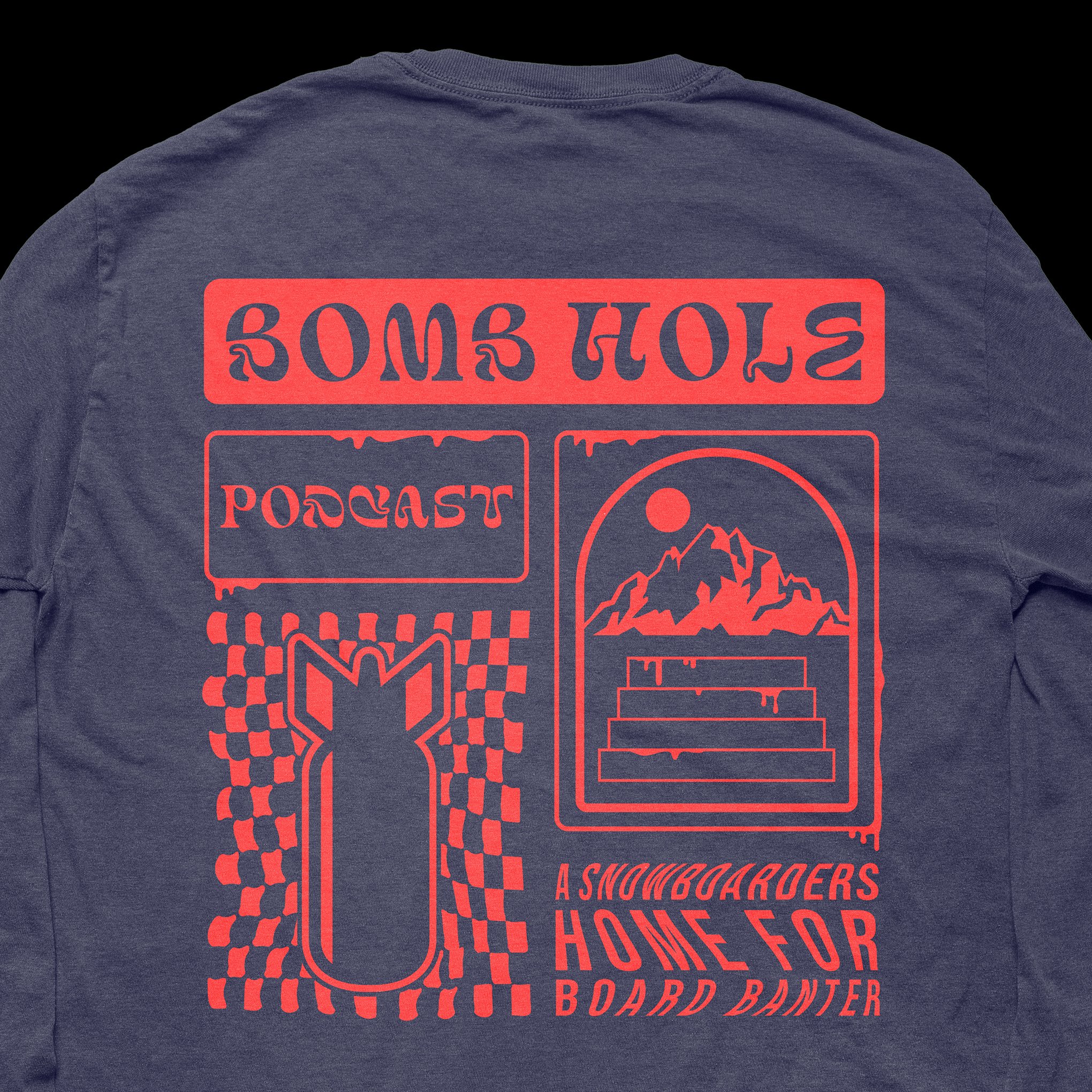
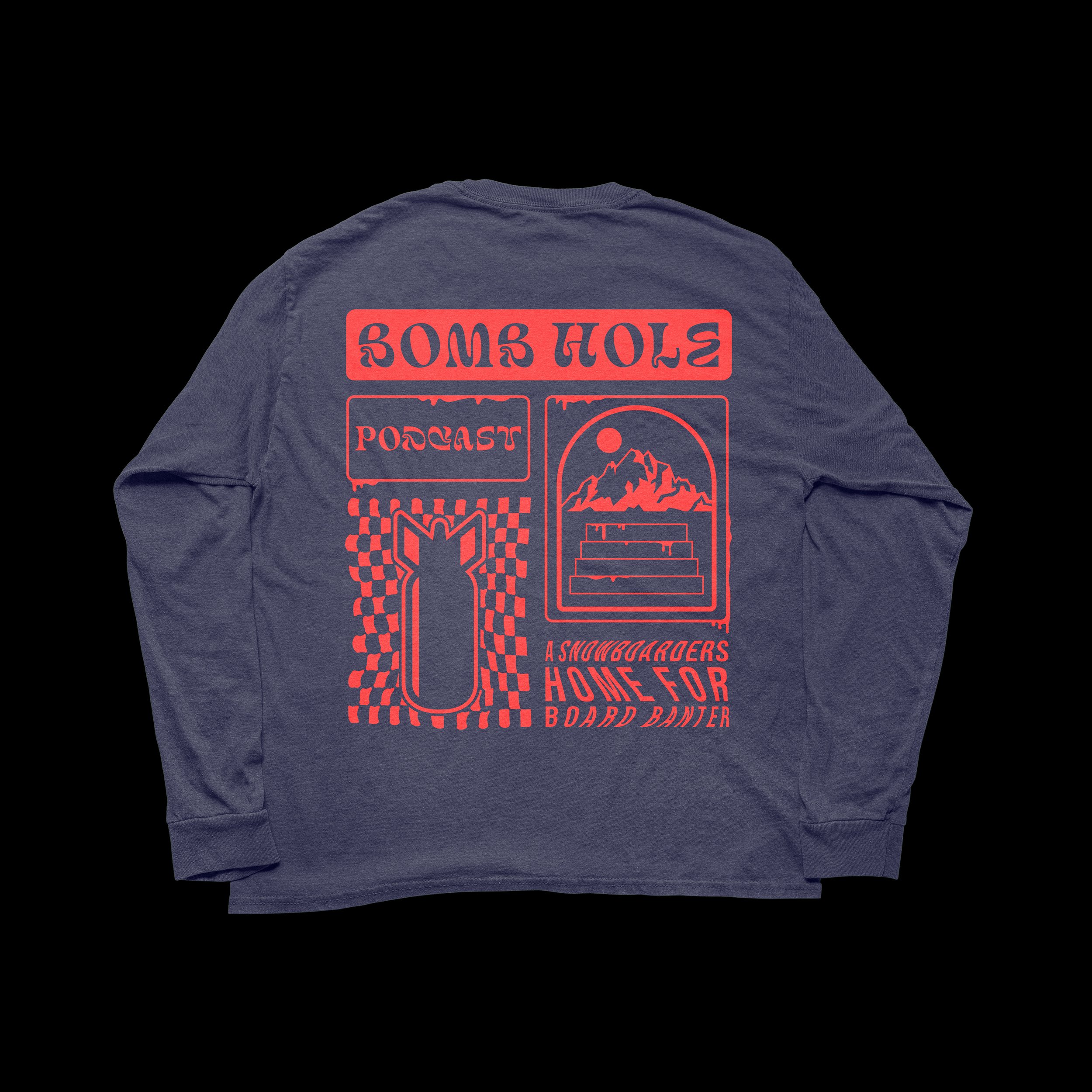
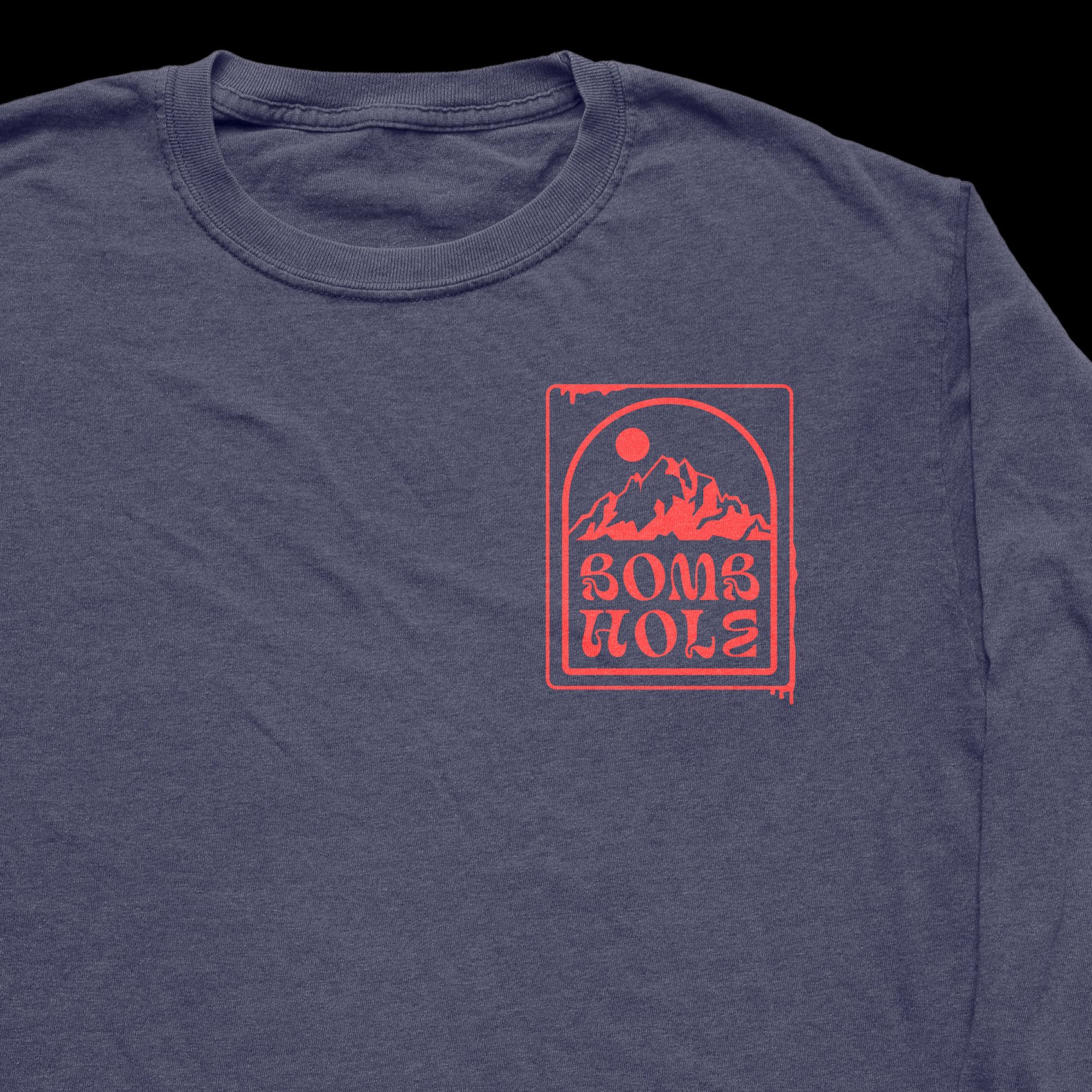
Sometimes when an idea hits, it just starts to flow. Embracing the slightly odd visual treatments, I landed here. Big bold lines, solid fill shapes, a mountain range, and a bomb graphic shape.

BH_2022_Comp3-BackC-Cropped.jpg
BH_2022_Comp3-BackC.jpg
BH_2022_Comp3-FrontC.jpg
BH_2022_Comp3-FrontC-Cropped.jpg
BH_2022_Comp3-BackB-Cropped.jpg
BH_2022_Comp3-BackB.jpg
BH_2022_Comp3-FrontB.jpg
BH_2022_Comp3-FrontB-Cropped.jpg
BH_2022_Comp3-Art-05.jpg
BH_2022_Comp3-Art-07.jpg

The Bomb Hole Tee Contest 2022 Entry 3

As a huge fan of the show and a frequent listener, I was inspired to create this design for the sole reason that every once in a while “The Boys of Banter” will have on motorcycle pros.

As a huge fan of motorcycles and all things FMX, I thought it would be cool to show a rider heading to the mountains (Brighton mountain range in the background) with a snowboard strapped to the backpack.

I also wanted it to look and feel like an old vintage outdoor gear label or a beer brand. Maybe that comes through for some…

BH_2022_Comp4-FrontB-Cropped.jpg
BH_2022_Comp4-FrontB.jpg
BH_2022_Comp4-Art-06.jpg
BH_2022_Comp4-FrontA-Cropped.jpg
BH_2022_Comp4-FrontA.jpg
BH_2022_Comp4-Art-03.jpg

The Bomb Hole Tee Contest 2022 Entry 4

Inspired by simplicity and iconography, I wanted this design to show one continuous line that created a mountain range and bomb shape. I couldn’t decide on which colorway, but if I had to pick, it’d be the multi-color version.

BH_2022_Comp5-BackA.jpg
BH_2022_Comp5-FrontA.jpg
BH_2022_Comp5-Art-03A-01.jpg
BH_2022_Comp5-Art-03.jpg
BH_2022_Comp5-BackB.jpg
BH_2022_Comp5-FrontB.jpg
BH_2022_Comp5-BackC.jpg
BH_2022_Comp5-FrontC.jpg

The Bomb Hole Tee Contest Entry 1

Preface: August 2021, The Bomb Hole Podcast ( a snowboard focused program produced each week) held a Tee Shirt design contest where artists and designers alike could submit unlimited designs for selection by it’s viewers/followers to determine a single winner. The winner got to have their design produced on a shirt for the BH online store.

B&W Spirals - Contest Results: Top 10

Inspired by 80’s/90’s op art style, screen print style texturing along with a nod to Designer David Carson with cut-up type and shapes worked into the layout. I include a microphone and profile of a snowboard binding tying in the theme of the podcast.

BH_BH Orange Crew Front.jpg
BH_BH Orange Crew Back.jpg
BH_BH Orange Crew Front Table Shot.jpg

The Bomb Hole Tee Contest Entry 2

Preface: August 2021, The Bomb Hole Podcast ( a snowboard focused program produced each week) held a Tee Shirt design contest where artists and designers alike could submit unlimited designs for selection by it’s viewers/followers to determine a single winner. The winner got to have their design produced on a shirt for the BH online store.

VX Reaper - Results: Runner-up

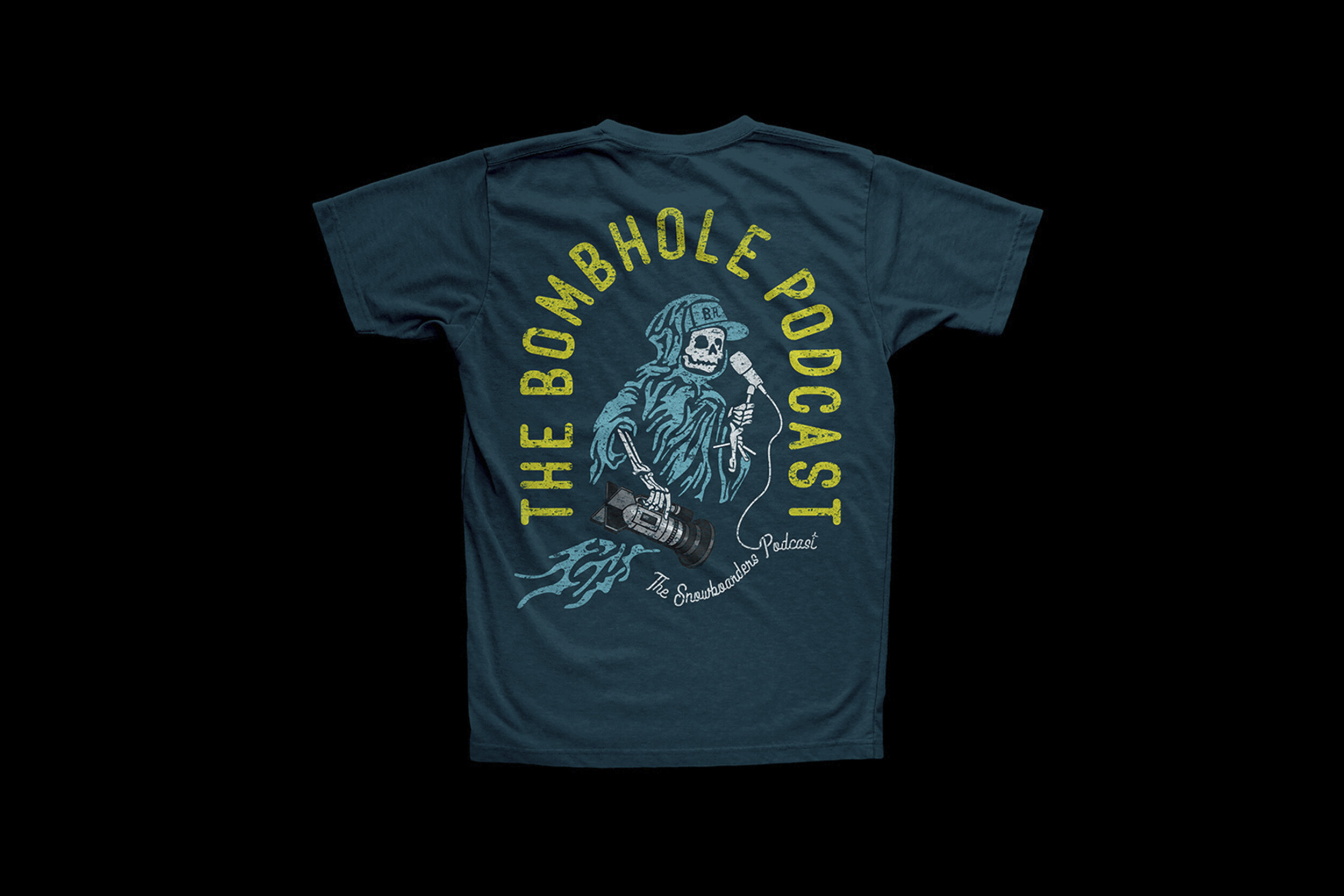
A nod to the Bomb Hole’ss large sponsor Liquid Death water and the skull can graphic, I got inspired to develop a version calling out the BH bomb logo that doubles as film camera and a microphone in hand tying back to the podcast.

BH_Reeper Ghost Front Crop.jpg
BH_Reeper Ghost Table Shot.jpg

The Bomb Hole Tee Contest Entry 3

Preface: August 2021, The Bomb Hole Podcast ( a snowboard focused program produced each week) held a Tee Shirt design contest where artists and designers alike could submit unlimited designs for selection by it’s viewers/followers to determine a single winner. The winner got to have their design produced on a shirt for the BH online store.

Simple Script Logo Lockup

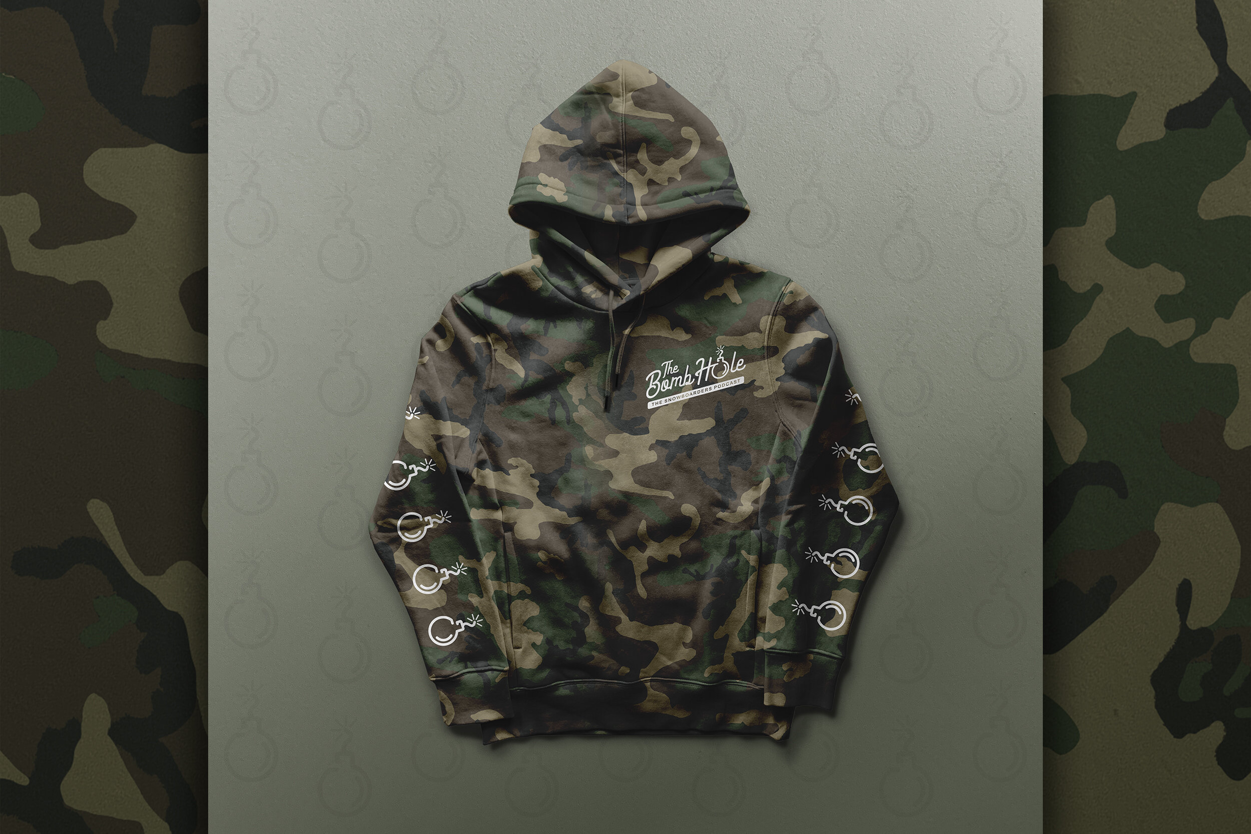
A simpler approach to a logotype lockup. Simple line art script lettering with a stylized “bomb” worked into the “O”.

Inspired by the overall garmet design, I worked into the comp 3 sections of the hoodie & tee; the logotype on the chest “bomb” icon on the sleeves and back.

BH_BH_SimpleScript_Tee_Hoodie_Mockup_Front-Camo.jpg
BH_BH_SimpleScript_Tee_Hoodie_Mockup_Back-Camo.jpg
BH_BH_SimpleScript_Logo.jpg

The Bomb Hole Merch Fam

Continuing with the theme of the tee shirt design for The Bomb Hole podcast, I wanted to develop additional merch to send into the show as a promotional piece set with my designs.

The coffee mugs has one of the BH logo designs I developed and the cooler is based on one of the shirt designs submitted into the original tee contest.

So why the mugs and cooler? On every show, the BH hosts have a segment of the show called name that snowboard video part for the guest. If the guest gets the right answer, the prize pack in an Igloo cooler filled with merch; mugs, shirts, stickers, air fresheners etc.

Each one of the items pictured here I sourced from various vendors. The shirts are screen printed, the mugs are laser engraved and the cooler is covered with a vinyl adhesive for for each of the cooler panel sections.

Merch Fam Pics_Merch Fam 8.jpg
BH_BH_SimpleScript_Logo Mug.jpg
Merch Fam Pics_Merch Fam 2.jpg
Merch Fam Pics_Merch Fam 3.jpg
Merch Fam Pics_Merch Fam 5.jpg
Merch Fam Pics_Merch Fam 4.jpg
Merch Fam Pics_Merch Fam 7.jpg

Foo Fighters Album Art Contest

Preface: Back in April 2020 this year, I saw an Instagram post for a contest calling out to artists to re-imagine album art of 6 chosen musicians and bands. If you were selected, your work would be printed on a 7” vinyl record sleeve with the artists featured song pressed onto the vinyl. You would also have your printed sleeve on display at the NOW Gallery in London, UK. Also, as apart of the show, each of the 700 submissions would be auctioned off with all the proceeds going to help the ChooseLove refugee charity efforts.

-–—

Celebrating 25 years this year, the Foo Fighters were one of the selections. The Foo’s first single was “This is a Call” released back in 1995.

Along with the submission, I included a write up about my work and its meaning.

-–—

Here’s what I wrote along with my submission:

"In the endless amount of YouTube videos, I listened to an interview with Dave Grohl talking about the origin of the band name. At the same time Dave was developing the first Foo’s album, he was reading a book called “Above Top Secret”. The book documents how during WW2, the Royal Airforce pilots would identify UFO sightings over Europe and named them Foo Fighters.

My design inspiration was based upon vintage WW2 Royal Airforce posters. In my research, I found that all of the posters were illustrations that imagined planes and pilots in various in-air dog fight scenarios. I carried that same illustration look and feel and dog fight sentiment throughout my design. My composition consists of a hero shot of both an RAF fighter plane and pilot in the foreground. Consistent with the original Foo’s album art elements, I show 2 other planes and one other UFO chasing one another in the air. The overall coloring and texture is meant to look like a folded vintage poster worn and weathered over time.

Foo Fighters Album_Foo Fighters Album Art 1.jpg
Foo Fighters Album_Foo Fighters Album Art 0.jpg
Foo Fighters Album_Foo Fighters Album Art 3.jpg
Foo Fighters Album_1.jpg
Foo Fighters Album_2.jpg
Foo Fighters Album_3.jpg
Foo Fighters Album_Foo Fighters Album Art 5.jpg
Secret 7%22 2020_3.jpg
Foo Fighters Album_Foo Fighters Album Art 6.jpg
Foo Fighters Album_Foo Fighters Album Art 7.jpg

Baseball Prospectus HOF Cover

The Ask:
Baseball Prospectus had commissioned me again to design digital magazine covers for the 2016 Major League Baseball Hall of Fame inductees that year. The new inductees were Ken Griffey Jr. and Mike Piazza.

Working with a deep library of photos provided to me, I wanted to find iconic imagery of both players. One of my favorite images the meant the most to me as a fan, was the famous Ken Griffey Jr. Swing. Any kid from the 90’s (such as myself) remembers Griffey’s infectious smile and big stretched out homerun swing of his; and of course the iconic backwards Seattle Mariners cap during batting practice.

For each of these covers, I wanted to make the images look like a painting. I used muted colors, textures and sketch-like aesthetics throughout. These covers were very well recieved by the publishers and BP client I was working with.

Griffey_Cover_Griffey Cover 3.jpg
Griffey_Cover_Griffey Cover 1.jpg
Griffey_Cover_Griffey Cover 2.jpg

Baseball Prospectus HOF Cover

The Ask:

Baseball Prospectus had commissioned me again to design digital magazine covers for the 2016 Major League Baseball Hall of Fame inductees that year. The new inductees were Ken Griffey Jr. and Mike Piazza.

Working with a deep library of photos provided to me, I wanted to find iconic imagery of both players. One of my favorite images the meant the most to me as a fan, was the famous Ken Griffey Jr. Swing. Any kid from the 90’s (such as myself) remembers Griffey’s infectious smile and big stretched out homerun swing of his; and of course the iconic backwards Seattle Mariners cap during batting practice.

For each of these covers, I wanted to make the images look like a painting. I used muted colors, textures and sketch-like aesthetics throughout. These covers were very well recieved by the publishers and BP client I was working with.

Pizza_Cover_Piazza Cover 2.jpg
Pizza_Cover_Piazza Cover 1.jpg
Pizza_Cover_Piazza Cover 3.jpg

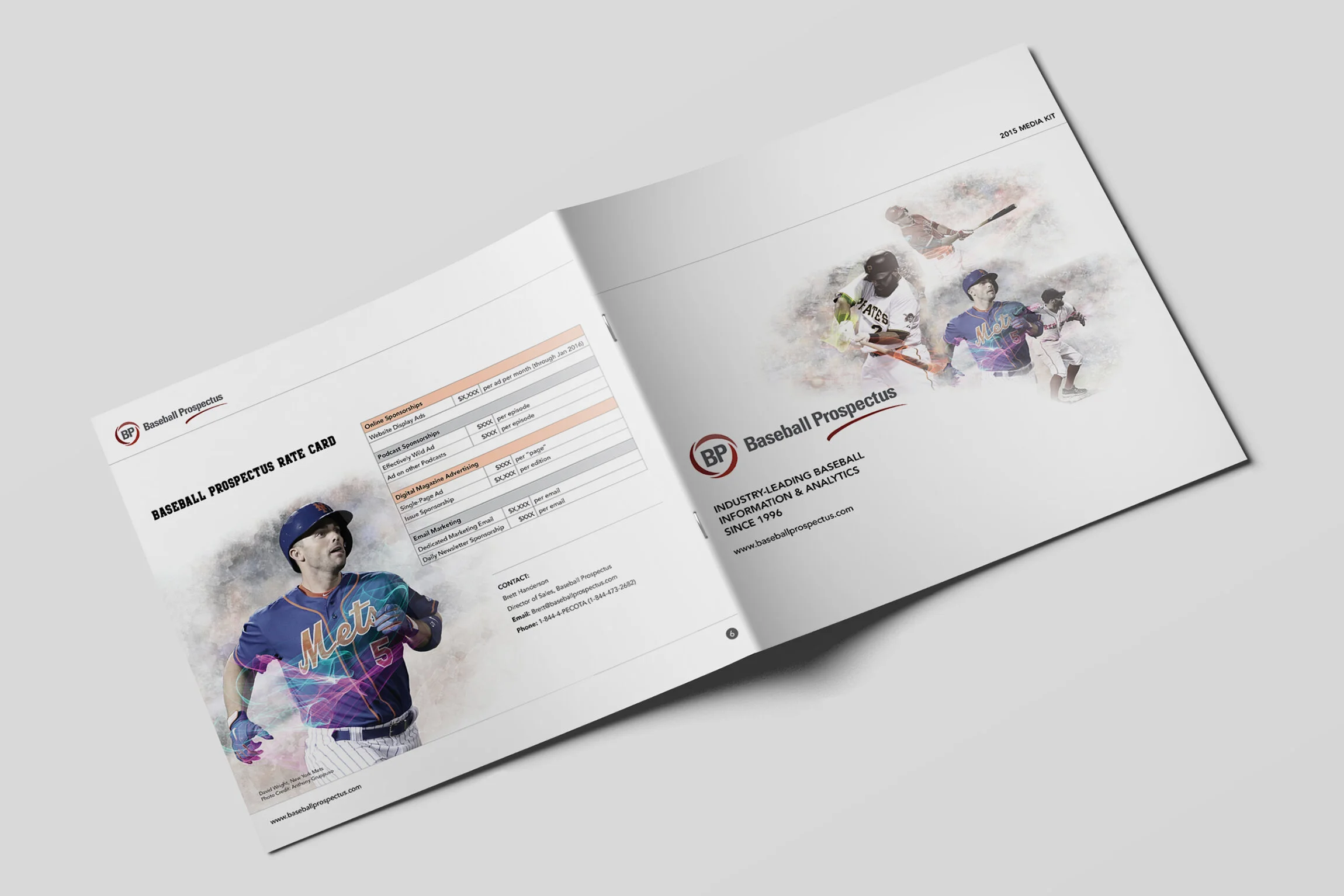
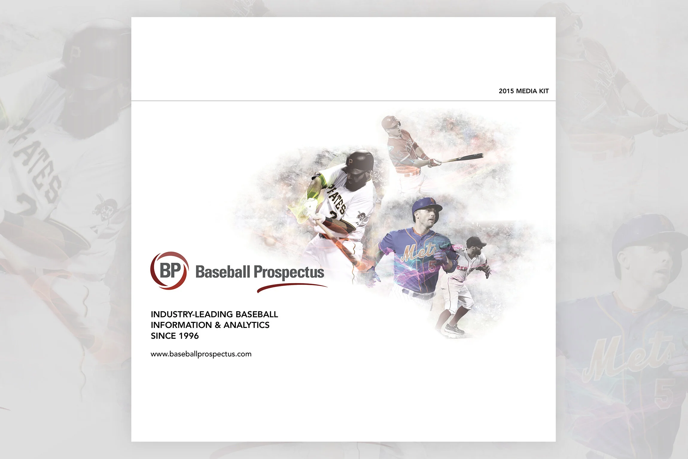
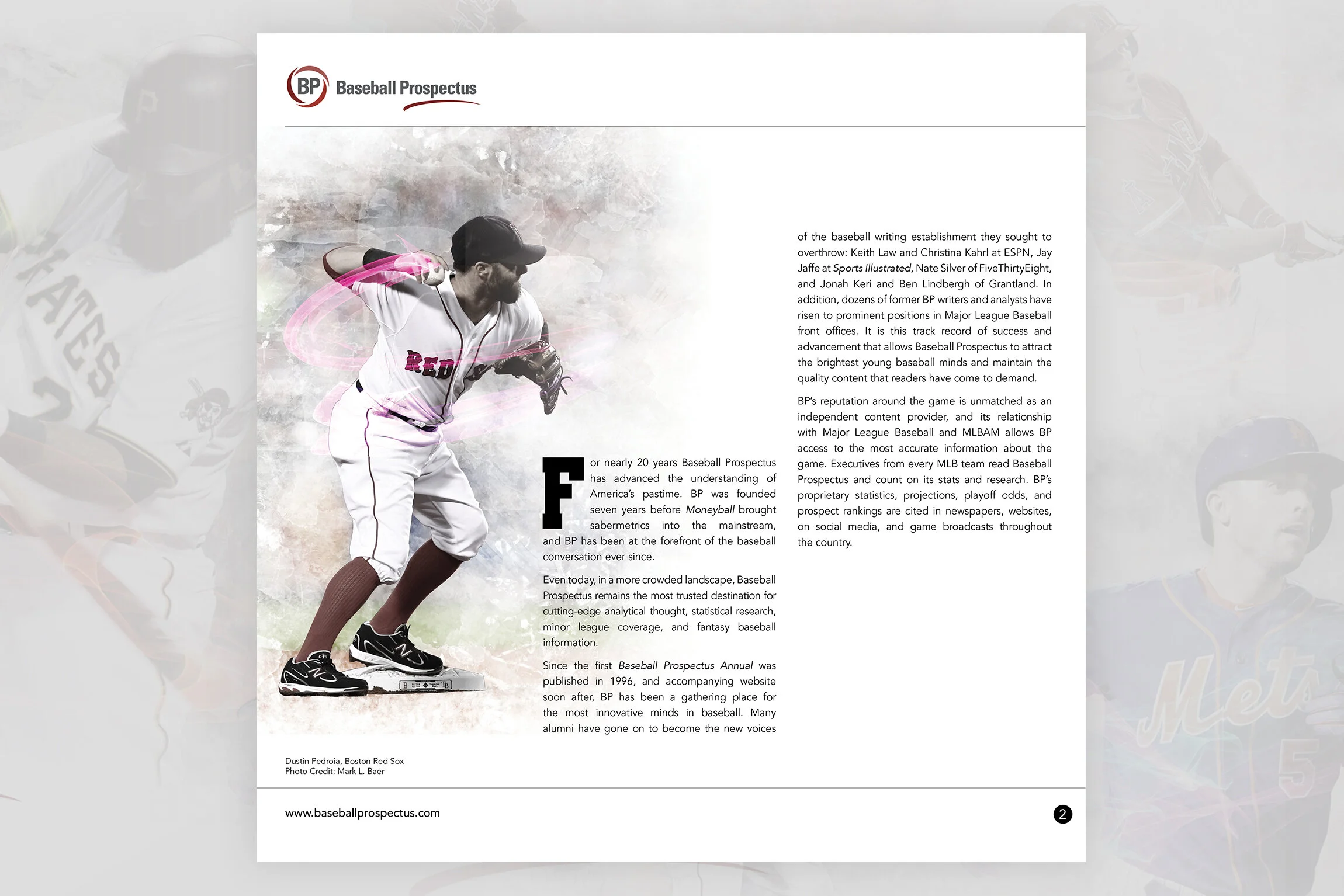
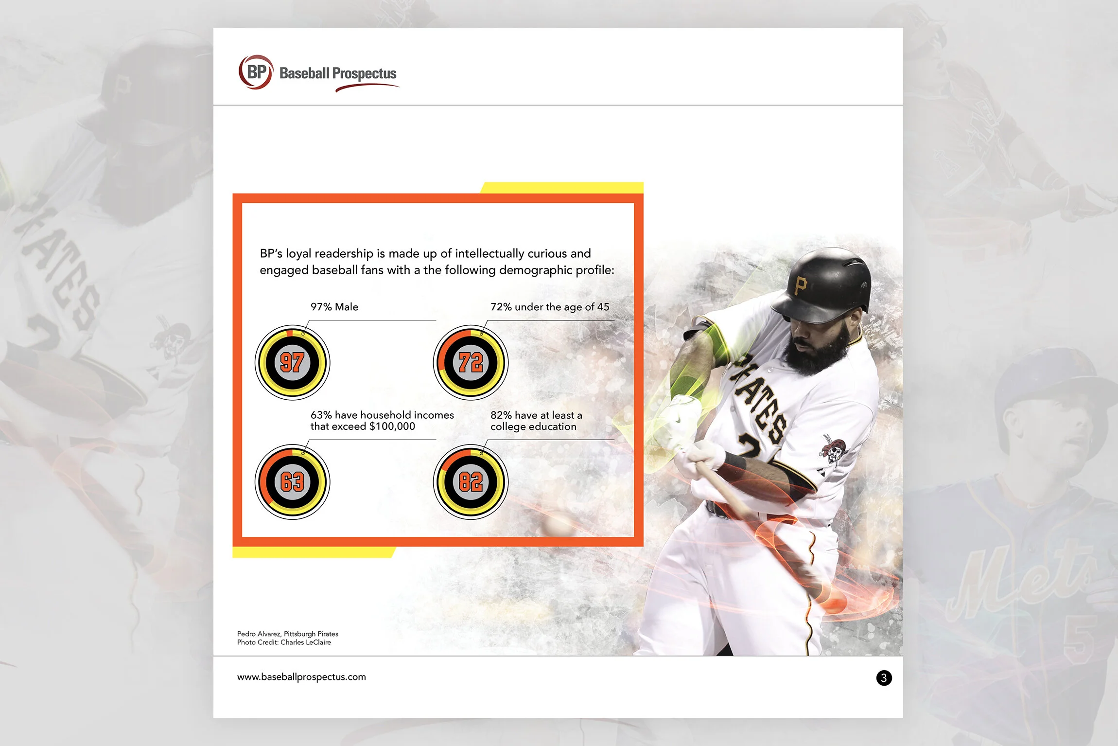
Baseball Prospectus Media Kit

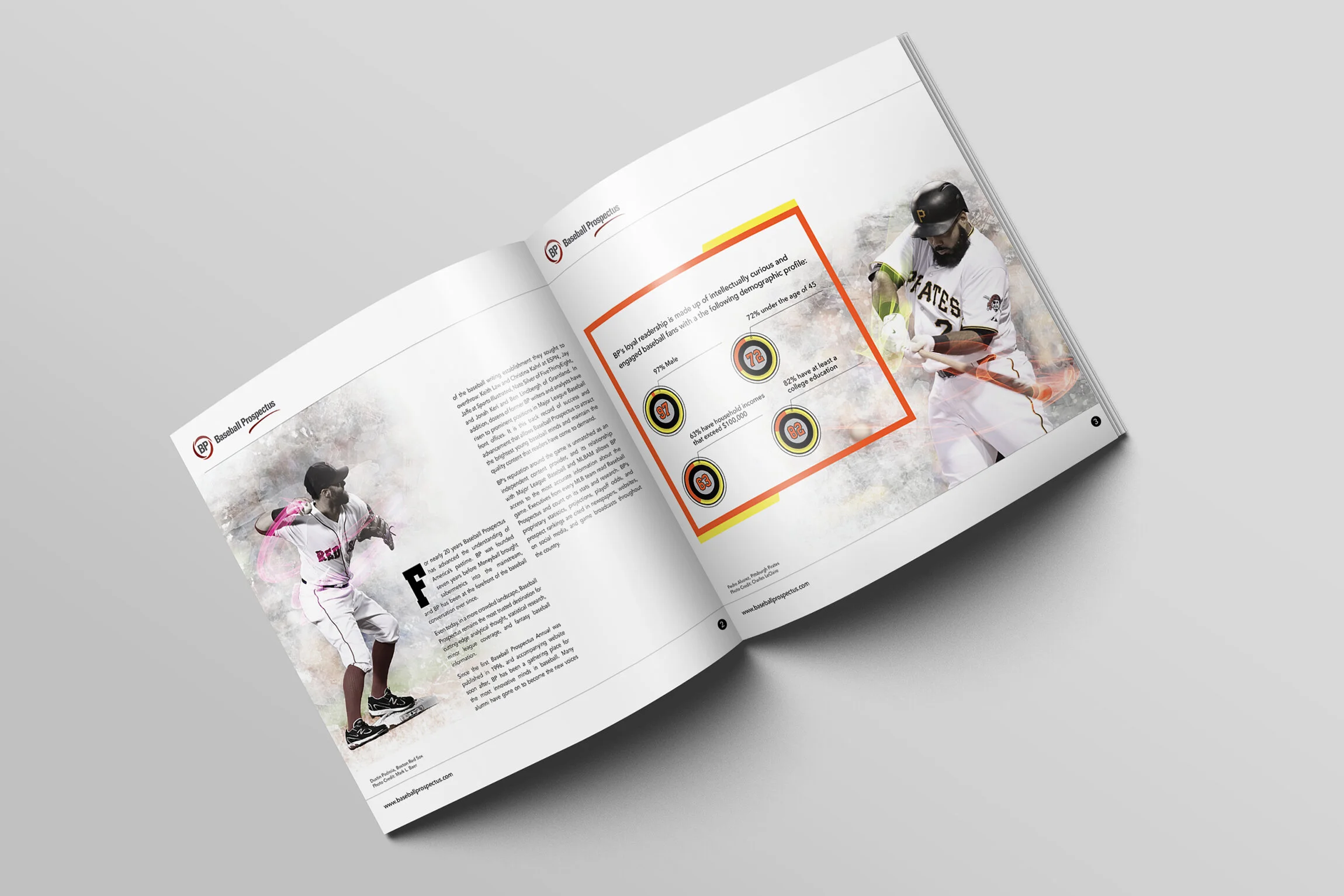
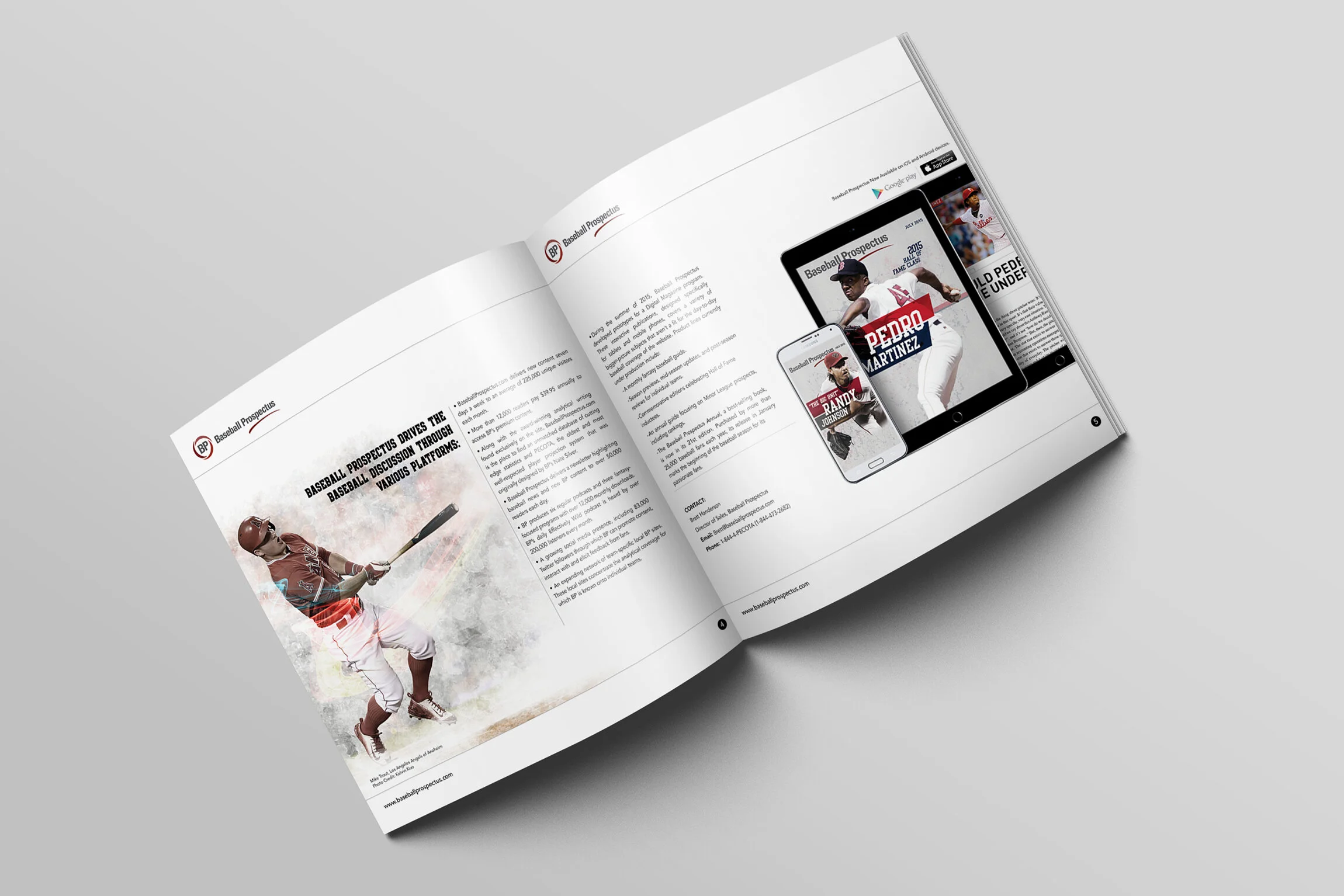
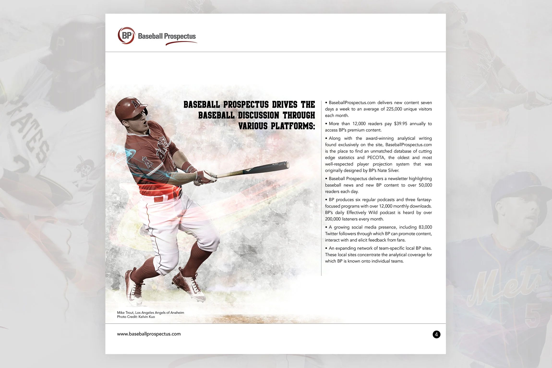
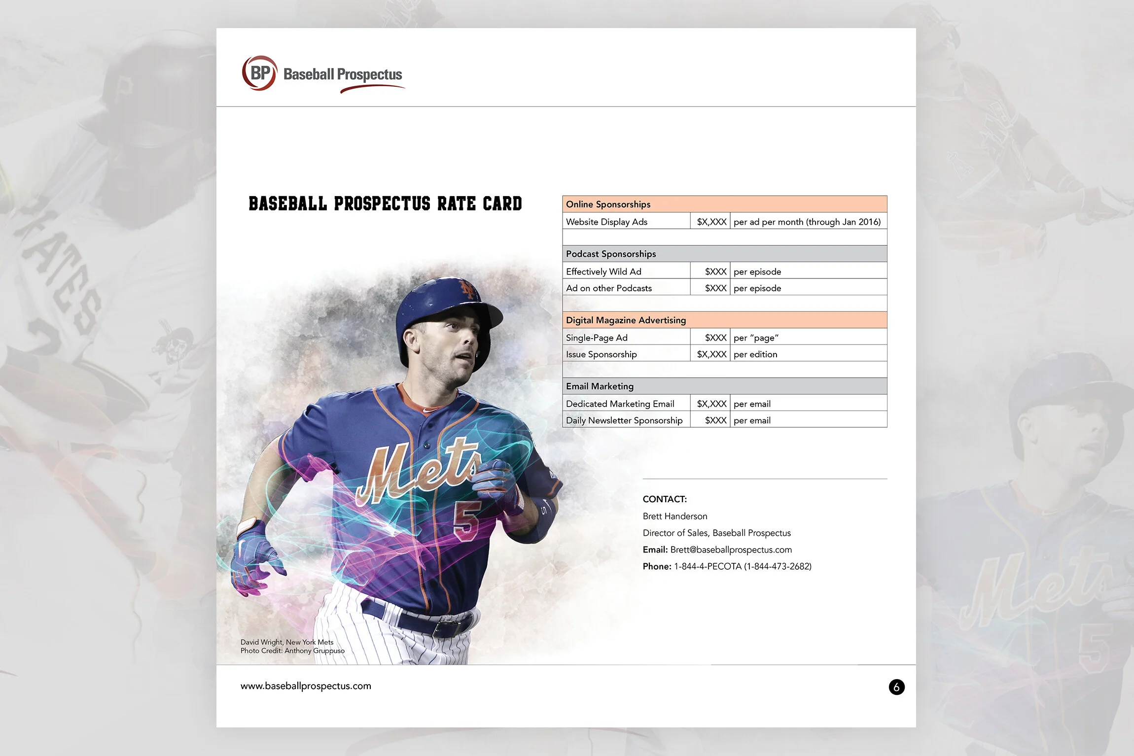
The Ask: I was asked by my Baseball Prospectus client to develop a promotional sales media kit design. Working with this client, I recieved various forms, charts & graphs and statistical data.

My challenge was to digest this information and come up with the best way to present this information. I had access to a library of professionally shot images for Major League Baseball and pulled out a variety of current players to work with in the design & layout.

BP_Media_Kit_BP 1.jpg
BP_Media_Kit_BP 2.jpg
BP_Media_Kit_BP 3.jpg
BP_Media_Kit_BP 4.jpg
BP_Media_Kit_BP 5.jpg
BP_Media_Kit_BP 6.jpg
BP_Media_Kit_BP 7.jpg
BP_Media_Kit_BP 8.jpg
BP_Media_Kit_BP 9.jpg

Agency Work: Coke Zero

Work description to come…

Coke_Coke_Zero 1.jpg
Coke_Coke_Zero 2.jpg
Coke_Coke_Zero 3.jpg

Agency Work: Showtime

Work description to come…

Showtime_Showtime-Banner300x250-resize2021 copy.jpg
Showtime_Showtime-Banner160x600-resize2021.jpg
Showtime_Layer Comp 1.jpg

Kendrick Lamar Poster Design

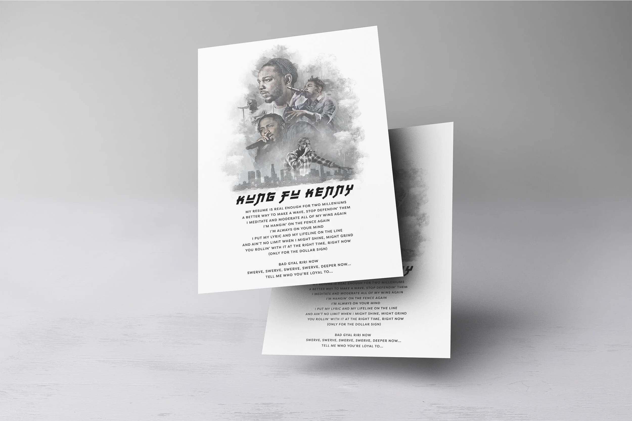
Kung Fu Kenny; a lyrical nickname given to the rapper triggered an idea for me to create this piece.

Inspired by lyrics from one of Kendrick Lamar’s songs Loyalty from his DAMN album, it inspired me to create a poster featuring the talented rapper and lyricist.

Working with a collage of photos, textures and color desaturations, it developed into one of those ideas as a fan, needed to get out of my head and onto a computer.

Kendrick_Lamar_Poster_Kendrick 3.jpg
Kendrick_Lamar_Poster_Kendrick 4.jpg
Kendrick_Lamar_Poster_Kendrick 1.jpg
Kendrick_Lamar_Poster_Kendrick 2.jpg
prev / next
Back to Personal Projects
FORUM_Ad_Comp1_JP_JP White Square 2.png
7
FORUM JP Walker Welcome Back
4
FORUM Snowboard Concept
4
Jeremy Jones Clip High Board Concept
5
Marhar Snowboards Concept
7
DC Snowboards Concept
4
Salomon Snowboards Concept
4
Salomon Snowboards Concept 2
7
The Boarding House Logo Design
4
Foo Fighters Forever Fans Tee
7
Foo Fighters 'Ol Saint Nick Beer
6
The Bomb Hole Podcast
10
The Bomb Hole Podcast
6
The Bomb Hole Podcast
8
The Bomb Hole Podcast
3
The Bomb Hole Podcast
5
The Bomb Hole Podcast
4
The Bomb Hole Podcast
7
The Bomb Hole Podcast
10
Foo Fighters Album Art
3
Baseball Prospectus
3
Baseball Prospectus
9
Baseball Prospectus
3
Coke Zero
3
Showtime
4
Kendrick Lamar Poster Design

© 2023 Austin Hoyt Design. All rights reserved.